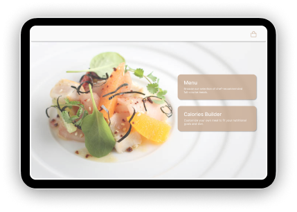
Kiosk Menu Design
Spring, 2023
Project Overview
I undertook a project in a university course to develop a design for a restaurant ordering kiosk. The primary objective of this kiosk was to deliver a top-notch ordering experience, akin to interacting with a waiter. Furthermore, I aimed to cater to health-conscious customers by providing them with comprehensive nutritional information, including calorie counts and other health-related statistics for every meal available at the restaurant.
Project Deliverables
1. Develop a tablet application that enables restaurant customers to place their orders seamlessly.
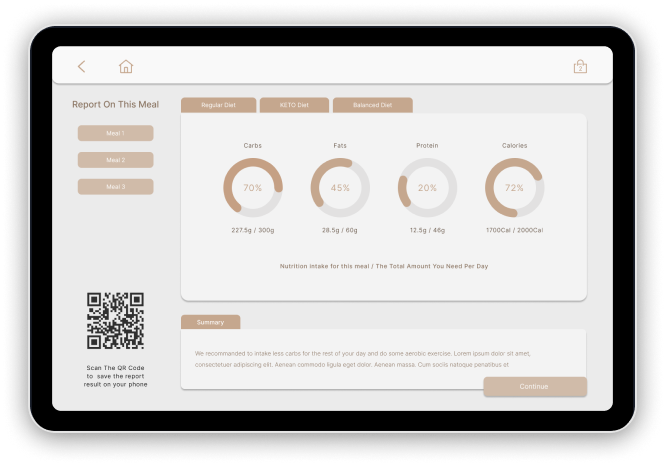
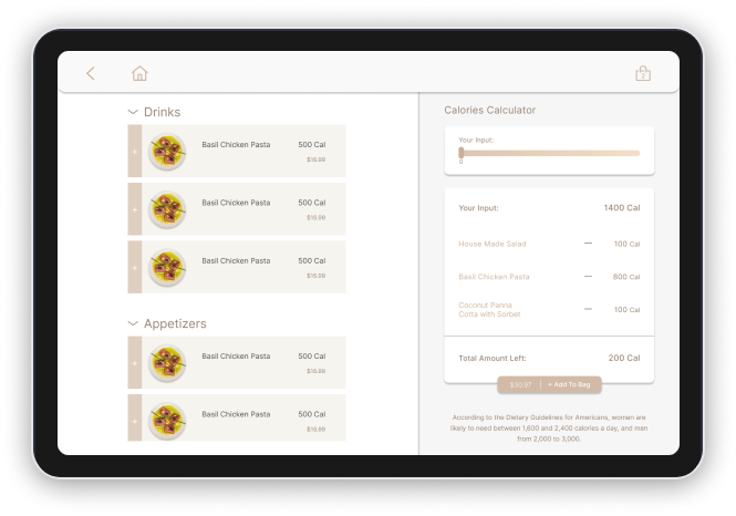
2. Incorporate a feature that allows customers to access nutritional information, including calorie counts, for their selected meals.
3. Provide a streamlined ordering experience for customers who prefer to choose from pre-set meal options.
Project Context
Role: UX Designer, UX Researcher
Project Length: 2 months
Project Location: Bothell, WA
Tools Used: Figma
User Research
Prior to commencing the development of the kiosk application, it was imperative to engage with potential users to comprehend their challenges and concerns. Armed with this knowledge, I was able to make informed decisions about which features to incorporate and exclude from the application.
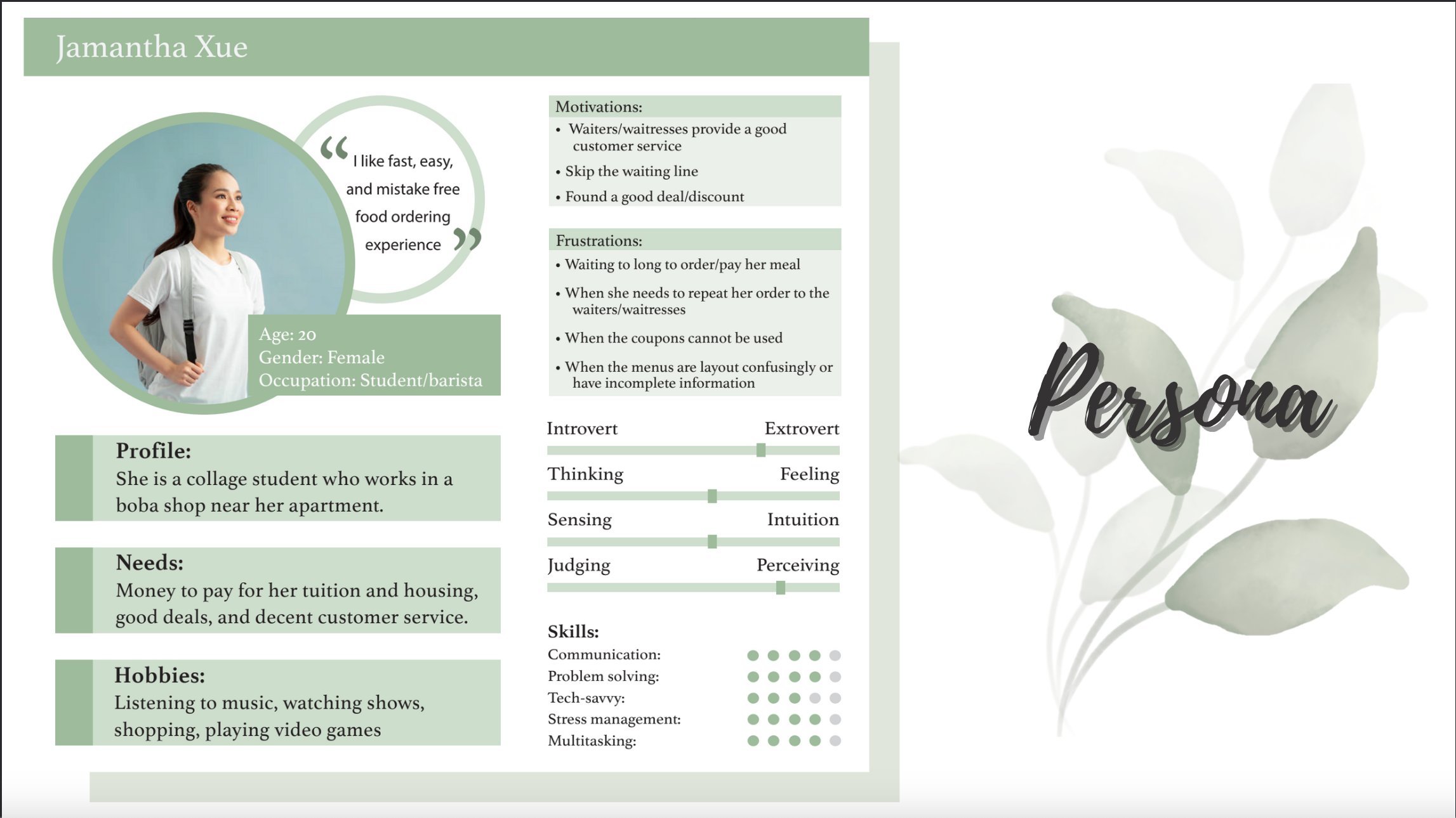
After conducting the interviews and compiling essential notes, I proceeded to develop customer personas (as illustrated above). These personas proved invaluable in directing my brainstorming and ideation efforts.
Brainstorming and Ideation
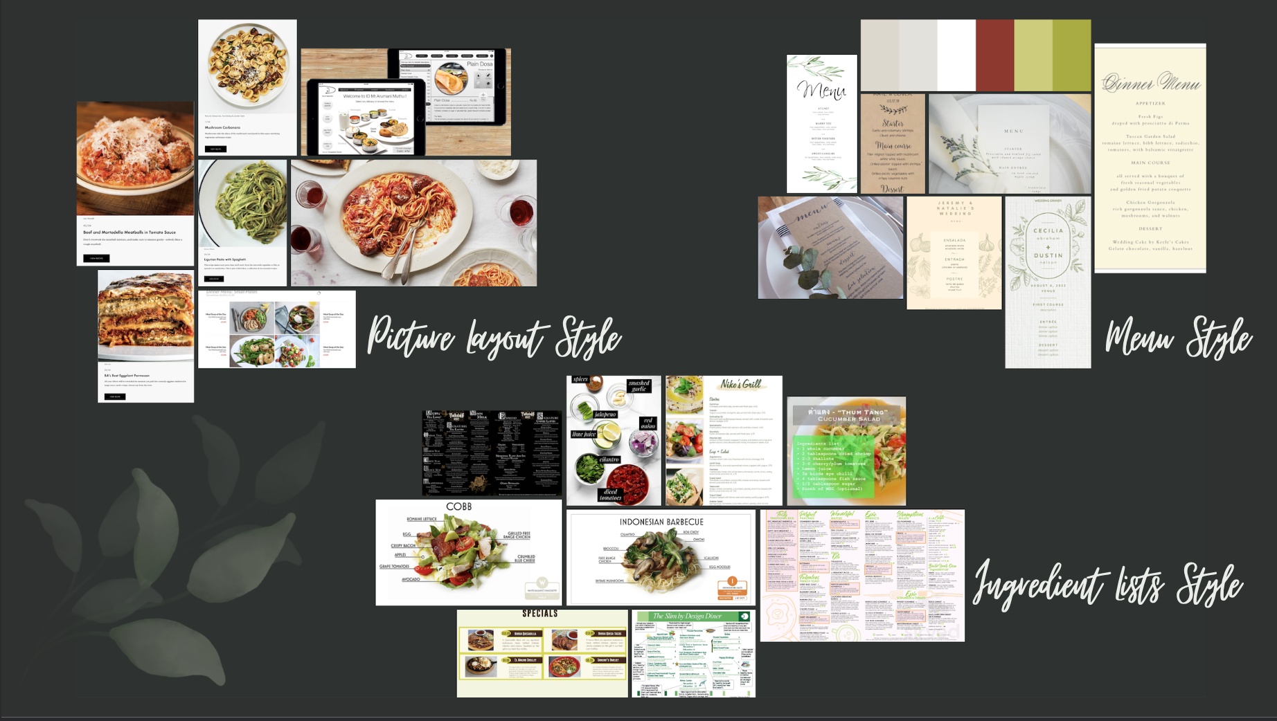
To stimulate my ideation process, I embarked on a search for inspiration, scouring various online sources to identify designs that resonated with my objectives. I curated a mood board (as depicted above) that aided me in solidifying the style, color scheme, and components I intended to incorporate into my initial design.
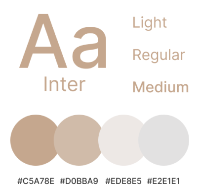
I selected a calming and healthy color scheme that can be seen on the right. The chosen colors were based on the mood board I created in the previous step. I wanted to create a sense of organic and natural vibes that would appeal to health-conscious customers. The light tan color creates a feeling of warmth and comfort, while many green images used evoke a sense of freshness and vitality. The font was also chosen based on the same principles of simplicity, clarity, and health. Together, the colors and font create a cohesive and visually appealing design that aligns with the goals of my project.
Design Process
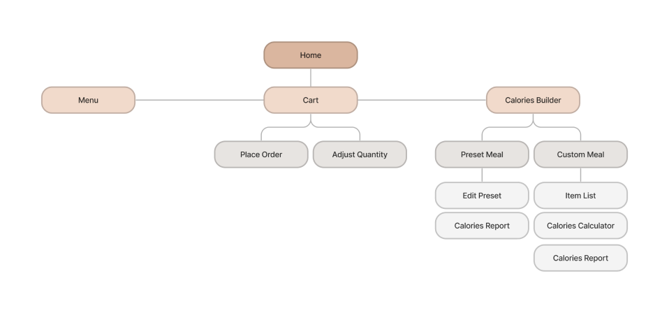
The diagram below illustrates the information architecture of the application, showcasing the pages and the actions that can be performed on them. I chose to utilize a modal popup system for various parts of the application because it allowed users to navigate through multiple layers with ease, while also reducing the mental load of figuring out which page they were on and how to return to previous screens. By using a modal popup system, users can focus on the task at hand without worrying about getting lost in a complex navigation system. This design decision was also based on research on user behavior and preference, which showed that users prefer a clear and simple navigation system that allows them to achieve their goals quickly and efficiently.
Design Solution
The end result of my project was a comprehensive solution in the form of a multi-page kiosk application specifically designed to run on a tablet device. my application successfully addressed the primary objectives of the project, which were to provide an efficient and seamless ordering experience to the users while also catering to the needs of health-conscious customers. The application enabled users to select from a range of preset meals or create their own custom meal plan based on their specific health goals.
To ensure that I developed a successful product with an intuitive user interface, I conducted multiple usability tests on a group of selected customers. These tests allowed me to gather feedback on my design, identify any potential issues, and make necessary improvements. By analyzing the results of these tests, I were able to iterate on the design and make the necessary changes to ensure that the final product met the needs of my target audience.
